Sharon Fields Law Office: Rebrand and Website Redesign

The problem:
When Sharon Fields, a Criminal Defense Attorney, needed to redesign her website, she needed a team of unapologetic women in her corner to build her site that stands out against the male-dominated competition, by blending in.
Sharon had come to Brick & Brine not liking her current logo, website, and overall branded colors. The use of red almost hit the mark, but it wasn’t quite there.
Sharon presented us with a unique challenge, how to create a new website that stands out among the competition but still holds up in the male-centric law industry, and even more so, criminal defense.
The rebrand.
Brick & Brine was tasked to come up with a fresh new logo and color palette that would inform the design direction of the website. The only objective was to incorporate the Goddess of Justice. The traditional goddess imagery is a familiar sight in law offices, the courts, and the concept of justice overall. We began the rebrand with explorations of unique plays on the goddess and explored muted green tones to reflect the natural Pacific Northwest environment where Sharon’s office is located.


The “Aha!” moment.
After several rounds of logo and color explorations, Sharon realized that red was, in fact, the right direction to go, and wanted Brick & Brine to pivot the color explorations. Taking cues from smoky bourbon bottles, and rich mahogany woods, we decided to circle back to the masculine and energetic colors and landed on the following color palette.

Sharon Fields Law Office Official Color Pallet
From there, Sharon had realized that there was a reason she was attracted to her original logo. The detailed line work, and the traditional font had appealed to her.
“Sometimes, it takes straying so far off the path of what you’re familiar with to really realize what truly resonates with you. There’s nothing wrong with going back to what you know you like. ”
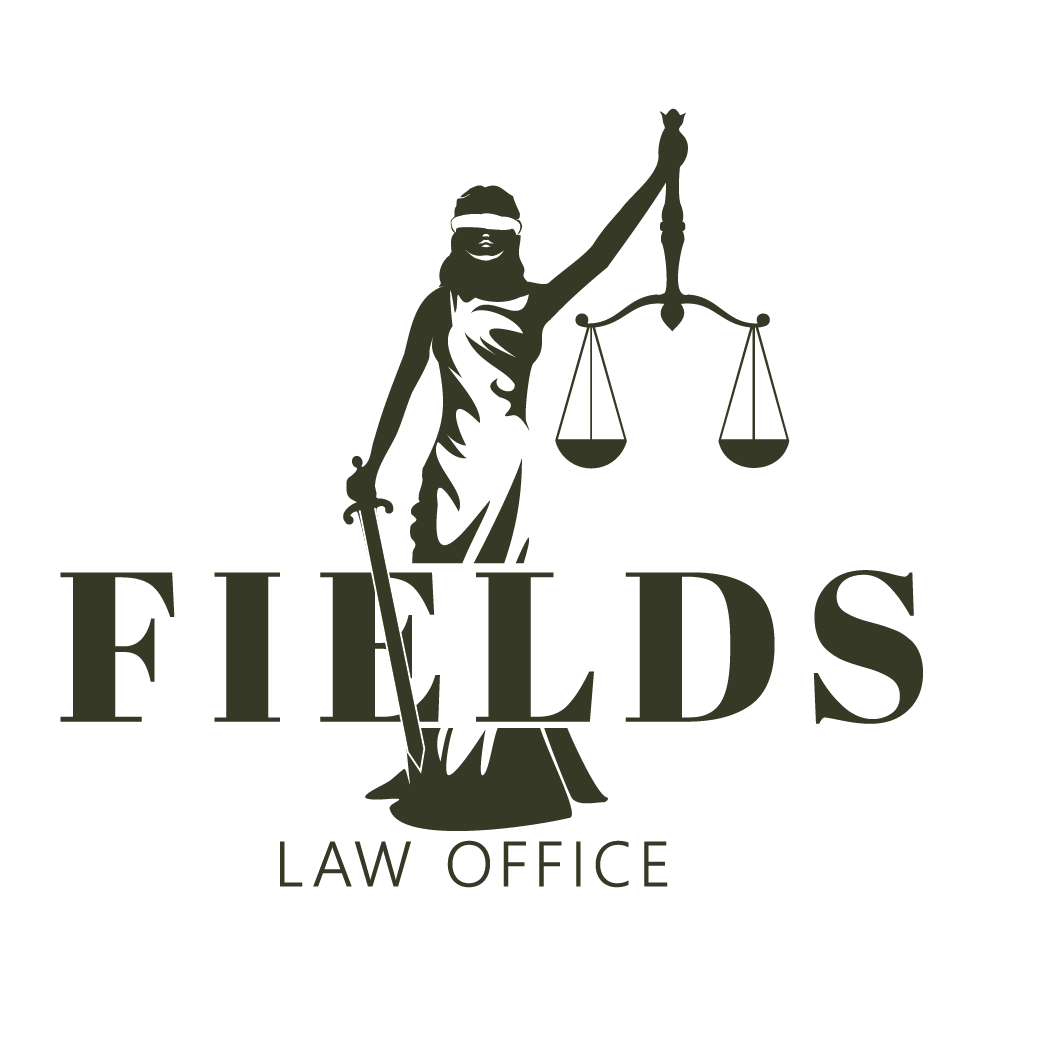
The logo becomes real.
It was at that aha moment that the direction of where to take Sharon’s new logo became clear. By shifting just some of the elements with more intention and purpose, Sharon wound up with a logo that she was incredibly happy with.
Sharon Fields Law Office Original Logo.

Sharon Fields Law Office Updated Logo
A new direction = a new website.
After developing the new branding direction, building Sharon Fields Law Office’s website happened seamlessly. It was easy to understand the pain points of the current site and what could effectively be done to modernize her site, while looking professional and providing a sense of strength and trust to her future clients.

Sharon Fields Law Office’s original website.

Sharon Fields Law Office’s new website.